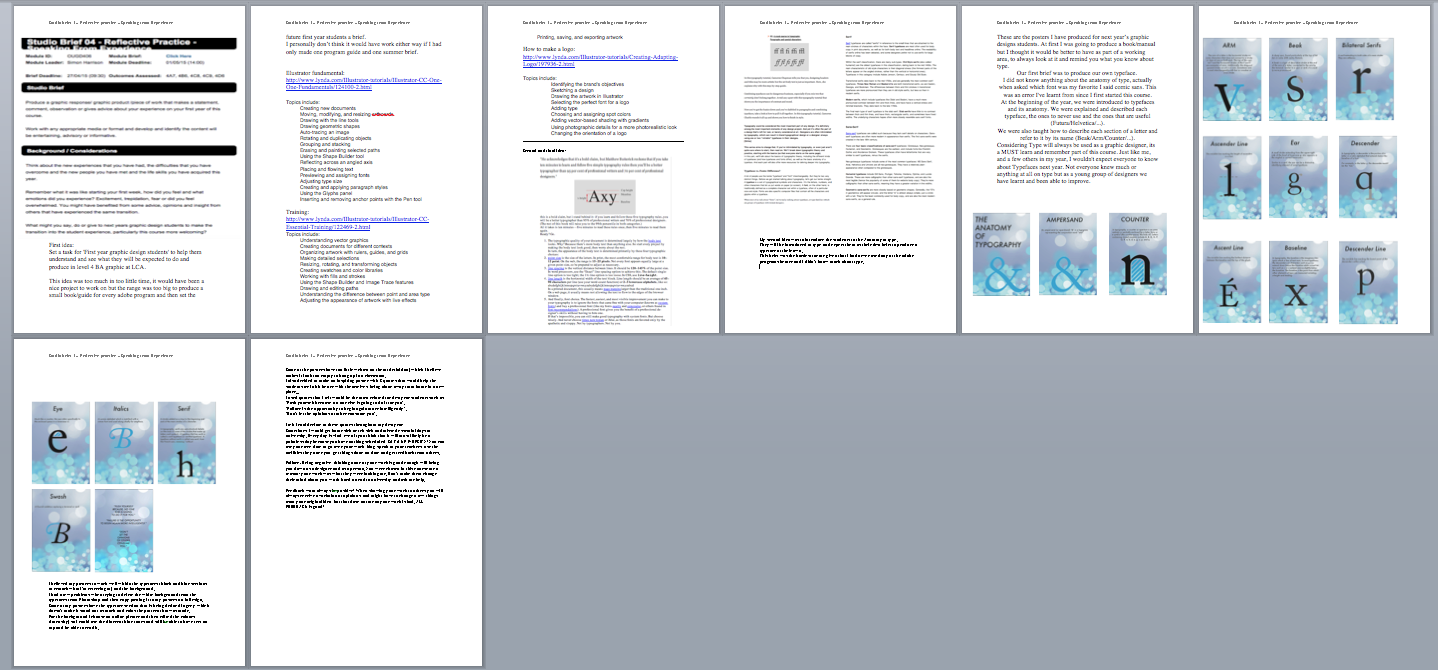
Monday, 9 November 2015

OUGD 504 - studio brief 2

Research:
What is it?
Who is kickstarter?
Why?
How?
Where?
Creator?
Origin?
Knowledge of the project?

Kickstarter helps artists, musicians, filmmakers, designers, and other creators find the resources and support they need to make their ideas a reality. To date, tens of
thousands of creative projects — big and small — have come to life with the support of the Kickstarter community.

We built Kickstarter to help bring creative projects to life. We measure our success as a company by how well we achieve that mission, not by the size of our profits. That’s why, in 2015, we became a Benefit Corporation.
When we became a Benefit Corporation, we amended our corporate charter to lay out specific goals and commitments to arts and culture, making our values core to our operations, fighting inequality, and helping creative projects come to life.

Since our launch, on April 28, 2009, 9.7 million  people have backed a project, $2 billion  has been pledged, and 94,326 projects have been successfully funded.

We’re an independent, founder-controlled company of 116 people working together in an old pencil factory in New York City. We spend our time designing and building Kickstarter, connecting people around inspiring creative projects, and having a lot of fun doing it.

Every Kickstarter project is an opportunity to create the universe and culture you want to see. The games you wish you could play, the films you wish you could watch, the technology you wish someone was building — on Kickstarter, people work together to make those things a reality.

https://www.kickstarter.com/about?ref=footer

What is branding?

-The marketing practice of creating a name, symbol or design that identifies and differentiates a product from other products .
An effective brand strategy gives you a major edge in increasingly
competitive markets. But what exactly does "branding" mean? Simply put, your brand is your promise to your customer. It tells them what they can expect from your products and services, and it differentiates your offering from that of your competitors. Your brand is derived from who you are, who you want to be and who people perceive you to be.

Are you the innovative maverick in your industry? Or the experienced,
reliable one? Is your product the high-cost, high-quality option, or the low-cost, high-value option? You can't be both, and you can't be all things to all people. Who you are should be based to some extent on who your target customers want and need you to be.

The foundation of your brand is your logo. Your website, packaging and promotional materials--all of which should integrate your logo
--communicate your brand.

branding strategies?

Your brand strategy is how, what, where, when and to whom you plan on communicating and delivering on your brand messages. Where you advertise is part of your brand strategy. Your distribution channels are also part of your brand strategy. And what you communicate visually and verbally is part of your brand strategy, too.

Consistent, strategic branding leads to a strong brand equity, which means the added value brought to your company's products or services that allows you to charge more for your brand than what identical, unbranded products command.
The added value intrinsic to brand equity frequently comes in the form of perceived quality or emotional attachment.

What is your company's mission?
What are the benefits and features of your products or services?
What do your customers and prospects already think of your company?
What qualities do you want them to associate with your company?
Get a great logo. Place it everywhere.

Write down your brand messaging. What are the key messages you want to communicate about your brand? Every employee should be aware of your brand attributes.

Integrate your brand. Branding extends to every aspect of your business--how you answer your phones, what you or your salespeople wear on sales calls, your e-mail signature, everything.

Create a "voice" for your company that reflects your brand. This voice should be applied to all written communication and incorporated in the visual imagery of all materials, online and off. Is your brand friendly? Be conversational. Is it ritzy? Be more formal. You get the gist.

Develop a tagline. Write a memorable, meaningful and concise statement that captures the essence of your brand.

Design templates and create brand standards for your marketing materials. Use the same color scheme, logo placement, look and feel throughout. You don't need to be fancy, just consistent.

Be true to your brand. Customers won't return to you--or refer you to someone else--if you don't deliver on your brand promise.

Be consistent. This tip involves all the above and is the most important tip on this list. If you can't do this, your attempts at establishing a brand will fail.


http://www.entrepreneur.com/encyclopedia/branding

What makes an effective logo?


-Develop/Design an effective logo
-Appear on at least 2 deliverable
(Poster/Packaging/CD/Advert/Website)

3 kickstarter projects to experiment with:

1. Wilderness Honeybush Tea by Anthony & Justyna
(https://www.kickstarter.com/projects/836355306/wilderness-honeybush-tea?ref=nav_search)

2. Paradice Board Game Cafe - London's Biggest In Bromley UK by Jason Grimwood
(https://www.kickstarter.com/projects/1130877477/paradice-board-game-cafe-londons-biggest-in-bromle?ref=nav_search)

3. Brand new London micro coffee Roastery by Viento Coffee
(https://www.kickstarter.com/projects/179211836/brand-new-london-micro-coffee-roastery?ref=nav_search)

Research:
1.”Help us make this leopard-friendly lifestyle drink a reality!”
<>By buying Wilderness Honeybush Tea you will be helping us to start a sustainable enterprise that not only brings the benefits of this herbal tea to a wider community but also funds environmental projects in the African wilderness where this herb is harvested.

Honeybush can only be found in parts of the Cape, South Africa. A lesser-known cousin of Rooibos, it is beginning to gain awareness amongst traditional and herbal tea drinkers.

(to clarify: no funds raised from this Kickstarter campaign will be donated to charity).

Since discovering Honeybush on the nature reserve a few years ago, we have been intrigued by this special herb and have sought to find out as much about it as possible before trying to share its magic with others around the world.

It is also believed to be a healthy brew: Honeybush tea is caffeine-free and rich in anti-oxidants. It contains polyphenols and isoflavones as well.

Our nature reserve, Oudeberg, lies on the western edge of the Baviaanskloof (Valley of Baboons) mega-reserve, UNESCO World Heritage Site, and contains some of the Kouga mountain range.


2.”Paradice will offer great coffee, craft beers, ciders, wine, cocktails and food. Plus you will be able to play old and new board games.”
Board game cafes are becoming a popular trendy social place to hang out with friends and family. A place to have a coffee, beer or glass of wine, and relax with friends playing some fantastic classics or new and complex games. Snakes and Lattes in Canada is the vanguard of this revolution and provides an amazing social hub over-seas. 
Warboar was founded by a gamer/hobbyist that wanted to make that “great place” for all hobbyists and enthusiasts to go to. Warboar opened its first shop in early 2014 and proved very successful, with a large range of retail products for the tabletop and board game industry, a gaming room downstairs to play games, and a reliable online presence that has grown hugely in the space of 2 years. Warboar won 2 awards during its infancy “Best start up business in London” and “Best new business in Bromley” the director of Warboar Jason Grimwood was also a finalist for Entrepreneur of the year.
Aims:
Massive gaming hall upstairs for bigger tabletop games and RPG’s also includes a sofa seating area
Huge retail area for the sale of board games and hobby items at discount
Friendly knowledgeable staff to help you learn to play
Great coffee, craft beers, ciders, wine and delicious cocktails and soft drinks sandwiches, paninis, cakes, snacks Gluten free and vegetarian options
Huge board game library to choose from.

3. Brand new London micro coffee Roastery by Viento Coffee, was my chosen project to work with.

Research:
Our goal is to expand our current operation out of simply supplying coffee to local coffee shops, to independently running our own shop, and also allowing our customers the chance to see every step of the journey their coffee bean takes from being a raw commodity into a perfectly blended cup of coffee. This will be achieved by an open floor design of our coffee shop showing the steps from roasting the coffee all the way up to pouring the milk for your very own latte.

What is a Roastery,

A Roastery is a place where coffee roasters take raw green coffee beans and transform the chemical and physical properties of the beans into the more commonly known product of coffee. It is because of this process that different types of beans contain different taste profiles. It is the key step in ensuring a balanced and well finished taste in your morning cup of coffee. Most coffee is roasted on a commercial scale, but we like to scale this down to more personalise batches, meaning that each batch has its own unique but refreshingly similar taste.

“We need the funding in order to secure a lease for a commercial property which will act as our flagship coffee store. the funding will help secure a long term lease on the property as well as the first few months of start up.”

Equipment is ready to be installed as soon as the location is secure for their new store. These include;

1 Coffee roasting machine

2 Coffee bean silos

3 Weight machines

4 Tables

5 Stools

6 Fridge

7 Coffee grinders

8 Coffee machine

9 Serving unit

10 Green bean scoops

11 Cctv cameras

12 Alarm system

13 Coffee packagings

14 Knok out unit

15 Tamping mat

16 Tamper

17 Green coffee beans

18 Coffee cups & spoons

19 Decoration items

20 Computer

21 Cash register

22 Staff uniforms

Evolution of final Design :

To produce a smarter and more realistic logo for this buisness, i will need;
Coffee Bean (Facial figure),
Mustache,
Black Top Hat,
Retro walking stick,
Coffee stain.

Staff working Shirt
  Front
<>Logo Bottom Left.
<>Brand name Top Right.
  Back
<> Central Brand Name.
<> Bigger Type.


Key Chain
<> Logo 
Central positioning.
<>Type
Brand Name. 


Branding Considerations:
How?
What?
Where?
Whom your communicating?
(Visual and Verbal) 
Plan Distribution?

Creating the coffee stains; I used different cups/glasses to produce different samples (changes in size, colour, shapes …)

When Producing the logo, I believed I could represent the business by creating a coffee man who would show how stylish, smart and refined the brand new London micro coffee is.

Final outcome:


Monday, 12 October 2015

OUGD 504 A-Z type in context studio brief 3


A. 
Bar Tangalanga - Friends bar (Pueblo Nuevo de Guadiaro/ San Roque/ Cadiz/ España) 
I Like the combination of the 2 types (Drawn and digital) and the combination of two different colours.
*Its not hard to read.
It communicates well, its eye catching, Modern, Different, Professional and casual.

B. 
Moon (Club) Party/ Event.
Not hard to read.
Effective, Bold, Simple.

C. 
Business - Effective.
Not hard to read.
H represents horse jumping. 
Clever and funny- For children (target audience).

D.
Restaurant.
Effective.
Not hard to read.
Retro - Traditional - Different type for the first letter of each word.

E.
Restaurant.
Effective.
Not hard to read.
Simple - Softs colours - thick strokes.
Different endings within the typeface shapes
(Serifs - Triangles - Squares - Ends)

F.
Moon (Club) Party/ Event.
Not hard to read.
Effective - eye catching - Thick outline - creative patterns used (Floral).

G.
Moon (Club) Party/Event.
Not hard to read.
Effective, but not eye catching
Blends with the background.

H.
Effective.
Friends business.
Not hard to read.
Thick starts within the typeface and thin strokes towards the end of the letter.

I.
Effective.
Not hard to read.
Original - Traditional image representing Spain.
Wine - Hat and Spanish guitar.
Feria.

J.
Schools NGO 
Effective.
Not hard to read.
Green - eco-friendly
Charity event.

K.
King Peter Moon party/Event.
Effective.
Not hard to read.
White and Blue good colour combination.
Simple.

L.
Business
Not effective
Hard to read
I don't particularly like the type or the colour.
Not eye catching in any sort of way.
Wrong placing on the outside of the shop.

M.
Moon (Club)
Effective
Not hard to read.
use of colour represents the night.


N.
Restaurant 
Not hard to read
Effective
Looks hand written, makes it more personal 
calm tones.

Ñ.
Extra letter for this brief.
Spanish Alphabet.
Not hard to read.
Inside letter colouring (out line).
Effective.
Spanish flag colours
Yellow and Red / Thin lettering 
soft and simple.

O.
Location 
Hard to read
Bold
Text on top - confusing to read or understand if your not from the area.
T underlines the word Sotogrande.


Wednesday, 7 October 2015

OUGD 504 - studio brief 1

Today we began 'My Design Process'.
When going through the brief, we got explained that the deliverables to this module were to complete a leaflet printed and folded, to explain the process to the final product and blog and create design boards to this brief.

In a group we produced a 'mind map' with all the essentials to follow a brief.

The Design Process
-Limitations,
-Concept,
-Scope - Scale of Production 
-Planning- Experimentations 
-Development- Digital 
-Organisation
-Proposals
-Strategy 
-Proofs
-Refinement 
-Presentations -Pitches/Design Boards
-Budget 
-Sketches
-Research (Reliable Sources/Target Audience/Prototypes/Primary and Secondary Sources)
-Evaluation 
-Professionalism 
-Stress!
-Mind maps - Generating ideas
-Questions 
-Production - Commercial? / Techniques 
-Briefing- Discussion with clients/ Debriefing 
-Flowcharts 
-Feedback - Acting + Improving on 
-Proposals
-Time Management 
-Analysis 
-Clients 
-Final Product  

We believed the best way to show this process was with the explanation of the production of a cake.
Stages: 
1.Discussing what cake to get/make.
2.Finding the best recipe.
3. Buying ingredients/test cake.
4.Is cake yum? (test)
5.Improving recipe (taste/test).
6.Break.
7.Taste tests.
8.Bake cake (Final product).
9.Eat cake/sell?

The other groups generated their own ideas;
Group 1. (Process explanation)
Define brief: 
*Interpret the brief.
*Analyse the brief.
*Expectations.
*Aims and Targets.

Research Background:
*Primary and Secondary.
*Brainstorms.
*Knowledge of what you are designing.
*Informative exploration.

Ideate Solutions:
*Final Considerations.
*Exploring Creative Approaches. 
*Thumbnails. 
*Variations.

Prototype Resolve:
*Problem solving.
*Potential Solutions.
*Further variations. 

Select Rationale:
*Idea Development. 
*Meeting Target.

Implement Delivery: 
*Delivering Solution.
*Final Outcome.
*Production Specification.

Learn Feedback: 
*Final Feedback.
*Critical Information.

Group 2. (Definitions)
*Discover: After briefing - Objectives obtained - relevant research-Audience/Techniques/Stock/Design

*Develop: Use feedback + Research to further the project.

Production:
I decided to continue with the idea of producing a cake to explain how to work on a brief.
I first designed my fold by hand. I would explain the steps only with illustrations and tittles.

Feedback:
*Use thinner stock.
*Smaller size paper (Product) A3 too big.
*Add Text (Explain your illustrations).
*Smaller size type.
*Good illustrations but not very space consuming/ Too much white blank spaces.


I designed my own little drawings to add to each page (Representations of each step).
I scanned my designs in to the computer and experimented on photoshop.
These were my final outcomes.


Final Production:
The Brief: 
*Interpret the Brief.
*Analyse the Brief.
*Expectations + Restraints.
*Aims and Targets.
<Discussing what cake to make>

Research:
*Primary and Secondary Information;
Books,
Newspapers,
Social Media,
Internet
...
*Brainstorms.
*Knowledge of what you are designing.
*Informative Exploration.
<Finding the best recipe>

Experiments:
*Producing different experiments (cake) to then show and test and decide on a final outcome.
<Buying the Ingredients>

Feedback:
<Is the cake YUM?
Try it!>

Develope/Refine:
*Final Considerations.
*Exploring Creative Approaches.
*Variation.
<Improving Recipe>

Break

Feedback:
*Meeting target.
Gain Critical Information.
*Idea development.
*Problem Solving.
*Potential Solutions.
*Further Variation.
<Taste Tests>

Production:
*Finalise your idea, 
look back at the brief to make sure it fits the criteria.
*Gain more feedback after these changes.
*Finalise your product.
<Bake cake + Recreate>

Selling the Product:
*Check your final product, 
Does it meet the criteria?
*Evaluate your work and test it.
*Is it ready to sell?
<Eat cake (Final Product) or sell>


Final Production:
I printed my Fold (left the black thick lines to be able to know where exactly to fold the paper).
My drawings look good when printed, the colour variation on each page works well and the amount of text in each page is not or too little or too much.

Feedback:
*Good Drawings - Original and Personal. 
*Funky and live Type - Makes it eye catching and adds colour to the pages.
*Thick black lines - Should be removed.
*Use thicker stock.
*Front page should be designed.
*Try producing a smaller version, Might be a better product.


Final Production:

Friday, 1 May 2015

OUGD406 evaluation

1. I didn't enjoy screen printing as much this time 
My work came out horribly wrong and had to re do it 
2. Secret 7 was the greatest and funnest part of this brief even though my work didn't get chosen 
3.I have another chance to participate on secret 7 next year, something I'm looking forward for.
4.This brief has given  me the opportunity to continue my learning within the Adobe program.
5.This brief has also given me and my year group the opportunity to display our work in public in the leeds library.
6. Re-designed a book cover (felt really professional and was a new experience).
7.We were able to see ourselves working among other designers not only for a submission (Brief) but also for some past students who needed help with their new company.
8. Personally the main problem I have had has been managing my time (PPP, COP, Studio Brief OUGD406 and Design Principles).
9. My personal mistake was taking my work with me back to Spain and forgetting some essential documents that i won't be able to submit.


OUGD406 working pages


EVALUATION:

Sunday, 26 April 2015

OUGD406- Studio Brief 4- Development

http://www.lynda.com/Illustrator-training-tutorials/227-0.html?utm_source=google&utm_medium=cpc&utm_campaign=l3-GB-Search-Dsg-Illustrator&cid=l3-gb:en:ps:lp:prosc:s40:227:all:google:mbm-adobe_illustrator_how_to&utm_content=71149651006&utm_term=%2Badobe%20%2Billustrator%20%2Bhow%20%2Bto&gclid=CPi7td7clMUCFeiWtAodKUkAcw

Illustrator fundamental:
http://www.lynda.com/Illustrator-tutorials/Illustrator-CC-One-One-Fundamentals/124100-2.html

Topics include:
  • Creating new documents
  • Moving, modifying, and resizing artboards
  • Drawing with the line tools
  • Drawing geometric shapes
  • Auto-tracing an image
  • Rotating and duplicating objects
  • Grouping and stacking
  • Erasing and painting selected paths
  • Using the Shape Builder tool
  • Reflecting across an angled axis
  • Placing and flowing text
  • Previewing and assigning fonts
  • Adjusting type size
  • Creating and applying paragraph styles
  • Using the Glyphs panel
  • Inserting and removing anchor points with the Pen tool

Training:
http://www.lynda.com/Illustrator-tutorials/Illustrator-CC-Essential-Training/122469-2.html

Topics include:
  • Understanding vector graphics
  • Creating documents for different contexts
  • Organizing artwork with rulers, guides, and grids
  • Making detailed selections
  • Resizing, rotating, and transforming objects
  • Creating swatches and color libraries
  • Working with fills and strokes
  • Using the Shape Builder and Image Trace features
  • Drawing and editing paths
  • Understanding the difference between point and area type
  • Adjusting the appearance of artwork with live effects
  • Printing, saving, and exporting artwork


Set a task for 'First year graphic design students' to help them understand and see what they will be expected to do and produce in level 4 BA graphic at LCA.

How to make a logo:
http://www.lynda.com/Illustrator-tutorials/Creating-Adapting-Logo/197936-2.html

Topics include:
  • Identifying the brand's objectives
  • Sketching a design
  • Drawing the artwork in Illustrator
  • Selecting the perfect font for a logo
  • Adding type
  • Choosing and assigning spot colors
  • Adding vector-based shading with gradients
  • Using photographic details for a more photorealistic look
  • Changing the orientation of a logo

http://www.creativebloq.com/graphic-design-tips/typography-tutorials-1232719
"He acknowledges that it's a bold claim, but Matthew Butterick reckons that if you take ten minutes to learn and follow five simple typography rules then you'll be a better typographer than 95 per cent of professional writers and 70 per cent of professional designers."
this is a bold claim, but i stand be­hind it: if you learn and fol­low these five ty­pog­ra­phy rules, you will be a bet­ter ty­pog­ra­pher than 95% of pro­fes­sional writ­ers and 70% of pro­fes­sional de­sign­ers. (The rest of this book will raise you to the 99th per­centile in both categories.)
All it takes is ten min­utes—five min­utes to read these rules once, then five min­utes to read them again.
Ready? Go.
  1. The ty­po­graphic qual­ity of your doc­u­ment is de­ter­mined largely by how the body text looks. Why? Be­cause there’s more body text than any­thing else. So start every project by mak­ing the body text look good, then worry about the rest.
    In turn, the ap­pear­ance of the body text is de­ter­mined pri­mar­ily by these four ty­po­graphic choices:
  2. point size is the size of the let­ters. In print, the most com­fort­able range for body text is 10–12 point. On the web, the range is 15–25 pix­els. Not every font ap­pears equally large at a given point size, so be pre­pared to ad­just as necessary.
  3. line spac­ing is the ver­ti­cal dis­tance be­tween lines. It should be 120–145% of the point size. In word proces­sors, use the “Ex­act” line-spac­ing op­tion to achieve this. The de­fault sin­gle-line op­tion is too tight; the 1½-line op­tion is too loose. In CSS, use line-height.
  4. line length is the hor­i­zon­tal width of the text block. Line length should be an av­er­age of 45–90 char­ac­ters per line (use your word-count func­tion) or 2–3 low­er­case al­pha­bets, like so:
    abcde­fghijklmnopqrstu­vwxyz­abcde­fghijklmnopqrstu­vwxyz­abcd
    In a printed doc­u­ment, this usu­ally means page mar­ginslarger than the tra­di­tional one inch. On a web page, it usu­ally means not al­low­ing the text to flow to the edges of the browser window.
  5. And fi­nally, font choice. The fastest, eas­i­est, and most vis­i­ble im­prove­ment you can make to your ty­pog­ra­phy is to ig­nore the fonts that came free with your com­puter (known as sys­tem fonts) and buy a pro­fes­sional font (like my fonts eq­uity and con­course, or oth­ers found in font rec­om­men­da­tions). A pro­fes­sional font gives you the ben­e­fit of a pro­fes­sional de­signer’s skills with­out hav­ing to hire one.
    If that’s im­pos­si­ble, you can still make good ty­pog­ra­phy with sys­tem fonts. But choose wisely. And never choose times new ro­man or Ar­ial, as those fonts are fa­vored only by the ap­a­thetic and sloppy. Not by ty­pog­ra­phers. Not by you.


In this typography tutorial, Cameron Chapman tells you that yes, designing headers and titles may be more artistic but the set body text is just as important. Here, she explains why with this step-by-step guide.

Combining typefaces can be dangerous business, especially if you mix two that certainly don't belong together. Avoid any upset with this typography tutorial that shows you the importance of contrast and mood.

Now you've got the basics down and you've dabbled in paragraphs and combining typefaces, take a look at how to pull it all together. In this typography tutorial, Cameron Charlie rounds it all up and shows you how to finish in style.


Typography could be considered the most important part of any design. It’s definitely among the most important elements of any design project. And yet it’s often the part of a design that’s left for last, or barely considered at all. Designers are often intimidated by typography, which can result in bland typographical design or a designer always using one or two “reliable” typefaces in their designs.
[fblike]

This series aims to change that. If you’re intimidated by typography, or even just aren’t quite sure where to start, then read on. We’ll break down typographic theory and practice, starting with the basics (so that everyone starts on the same page).
In this part, we’ll talk about the basics of typographic theory, including the different kinds of typefaces (and how typefaces and fonts differ), as well as the basic anatomy of a typeface. And each part will also offer more resources for delving deeper into typography.

Typefaces vs. Fonts: Difference?

A lot of people use the terms “typeface” and “font” interchangeably. But they’re two very distinct things. Before we get started talking about typography, let’s get our terms straight.
typeface is a set of typographical symbols and characters. It’s the letters, numbers, and other characters that let us put words on paper (or screen). A font, on the other hand, is traditionally defined as a complete character set within a typeface, often of a particular size and style. Fonts are also specific computer files that contain all the characters and glyphs within a typeface.

When most of us talk about “fonts”, we’re really talking about typefaces, or type families (which are groups of typefaces with related designs).

Classifying Type

There are a number of different ways to classify typefaces and type families. The most common classifications are by technical style: serif, sans-serif, script, display, and so on. Typefaces are also classified by other technical specifications, such as proportional vs. monospaced, or by more fluid and interpretational definitions, such as the mood they create.

Serif

Serif typefaces are called “serifs” in reference to the small lines that are attached to the main strokes of characters within the face. Serif typefaces are most often used for body copy in print documents, as well as for both body text and headlines online. The readability of serifs online has been debated, and some designers prefer not to use serifs for large blocks of copy.

Within the serif classification, there are many sub-types. Old Style serifs (also called humanist) are the oldest typefaces in this classification, dating back to the mid 1400s. The main characteristic of old style characters is their diagonal stress (the thinnest parts of the letters appear on the angled strokes, rather than the vertical or horizontal ones). Typefaces in this category include Adobe Jenson, Centaur, and Goudy Old Style.

Transitional serifs date back to the mid 1700s, and are generally the most common serif typefaces. Times New Roman and Baskerville are both transitional serifs, as are Caslon, Georgia, and Bookman. The differences between thick and thin strokes in transitional typefaces are more pronounced than they are in old style serifs, but less so than in modern serifs.

Modern serifs, which include typefaces like Didot and Bodoni, have a much more pronounced contrast between thin and thick lines, and have have a vertical stress and minimal brackets. They date back to the late 1700s.

The final main type of serif typeface is the slab serif. Slab serifs have little to no contrast between thick and thin lines, and have thick, rectangular serifs, and sometimes have fixed widths. The underlying characters hapes often more closely resemble sans serif fonts.

Sans-Serif

Sans-serif typefaces are called such because they lack serif details on characters. Sans-serif typefaces are often more modern in appearance than serifs. The first sans-serifs were created in the late 18th century.

There are four basic classifications of sans-serif typefaces: Grotesque, Neo-grotesque, Humanist, and Geometric. Grotesques are the earliest, and include fonts like Franklin Gothic and Akzidenze Grotesk. These typefaces often have letterforms that are very similar to serif typefaces, minus the serifs.

Neo-grotesque typefaces include some of the most common typefaces: MS Sans Serif, Arial, Helvetica and Univers are all neo-grotesques. They have a relatively plain appearance when compared to the grotesques.

Humanist typefaces include Gill Sans, Frutiger, Tahoma, Verdana, Optima, and Lucide Grande. These are more calligraphic than other sans-serif typefaces, and are also the most legible (hence the popularity of some of them for website body copy). They’re more calligraphic than other sans-serifs, meaning they have a greater variation in line widths.

Geometric sans-serifs are more closely based on geometric shapes. Generally, the “O”s in geometrics will appear circular, and the letter “a” is almost always simple, just a circle with a tail. They’re the least commonly-used for body copy, and are also the most modern sans-serifs, as a general rule.

Script

Scripts are based upon handwriting, and offer very fluid letterforms. There are two basic classifications: formal and casual. Formal scripts are often reminiscent of the handwritten letterforms common in the 17th and 18th centuries. Some scripts are based directly on the handwriting of masters like George Snell and George Bickham. There are modern creations, too, including Kuenstler Script. They’re common for very elegant and elevated typographical designs, and are unsuitable for body copy.

Casual scripts more closely resemble modern handwriting, and date back to the mid-twentieth century. They’re much less formal, often with stronger strokes and a more brush-like appearance. Casual scripts include Mistral and Brush Script.


Display

Display typefaces are probably the broadest category and include the most variation. The main characteristic is that they’re unsuitable for body copy and are best reserved for headlines or other short copy that needs attention drawn to it. Display typefaces can be formal, or informal, and evoke any kind of mood. They’re more commonly seen in print design, but are becoming more popular online with the use of web fonts.
Also included among display typefaces are blackletter typefaces, which were the original typefaces used with the first printing presses. Since that time, better, more readable fonts have been developed.

Dingbats and Specialty Typefaces

Dingbats are specialty typefaces that consist of symbols and ornaments instead of letters. Wingdings is probably the best-known dingbat font, though there are now thousands, often created around themes.

Proportional vs. Monospaced

In proportional typefaces, the space a character takes up is dependent on the natural width of that character. An “i” takes up less space than an “m”, for example. Times New Roman is a proportional typeface. In monospace typefaces, on the other hand, each character takes up the same amount of space. Narrower characters simply get a bit more spacing around them to make up for the difference in width. Courier New is one example of a monospace typeface.

Mood

The mood of a typeface is an important part of how it should be used. Different typefaces have strikingly different moods. Commonly used moods include formal vs. informal, modern vs classic/traditional, and light vs dramatic. Some typefaces have very distinct moods. For example, Times New Roman is pretty much always going to be a traditional font, which is why it’s so commonly used for business correspondence. Verdana, on the other hand, has a more modern mood.
Some typefaces are more transcendent, and can convey almost any mood based on the content and the other typefaces they’re combined with. Helvetica is often considered one such font.

Weights & Styles

Within the majority of typefaces, you’ll find more than one style and/or weight. Weights are often classified as “light”, “thin”, “regular”, “medium”, “bold”, “heavy”, or “black”. Each of these refers to the thickness of the strokes that make up the characters:

There are three general styles you’ll find with many typefaces: italic, oblique, and small caps. Small caps are often used for headings or subheadings, to add variety to your typography if using a single typeface.
Italic and oblique are often confused or used interchangeably, but are two distinct styles. Oblique type is simply a slanted version of the regular characters. You could create this using the “distort” function in Photoshop, although sometimes a separate oblique font is included within a typeface. Italics are slanted like obliques, but are actually a separate set of characters, with their own unique letterforms.

The Anatomy of a Typeface

The different letterforms within a typeface share a few common characteristics. These characteristics can be important in determining whether two (or more) typefaces work well together, or clash. Here are the most basic parts of a typeface:

The baseline is the invisible line that all the characters sit on. Rounded letters sometimes sit just a tiny bit under the baseline, and descenders always drop below this line. A given typeface will have a consistent baseline.
The meanline is the height of most of the lowercase characters within a typeface, and is generally based on the lowercase “x” if there are varying heights among the lowercase characters. This is also where the term “x-height” comes from. The cap height is the distance between the baseline and the top of uppercase letters like “A”.

three common parts to letterforms. The stem is the main upright of any letter, including the primary diagonal. It’s could be considered the anchor of the character. The bar is any horizontal part, which are sometimes also called arms. The bowl is the curved part of a character that creates an interior empty space. The inside of a bowl is a counter.

The ascender of a lowercase character is any part that rises above the meanline, such as the uprights on the letters “d”, “h”, and “b”. Descenders are the parts of a lowercase character that drop below the baseline, such as in a “p”, “q” or “g”.

Serifs are the extra flourish at the end of a stroke on serif typefaces. Some typefaces have verypronounced serifs, while others are barely distinguishable.

The aperture of a character refers to the opening at the bottom of some characters, such as the uppercase “A” or lowercase “m”. An ear is a decorative extension on a letter, as highlighted on the “g” above. Hairlines are the thinnest part of a serif typeface.


Crossbars are horizontal strokes, as found on the uppercase “A” and “H”. Terminals are only found on serif characters, and are the end of any line that doesn’t have a serif. Loops are found on some lowercase “g” characters, and can be fully closed or partially closed.

Spurs are tiny projections from curved strokes, such as on some uppercase “G” characters. Links connect the top and bottom bowls of a double-stacked lowercase “g”. The spine is the curved stroke found on the letter “s”.

Tails are sometimes-decorative descending strokes, as seen on an uppercase “R”. Finials are the tapered endings of some strokes. Shoulders are any curved stroke that originate from a stem.
Final work:


These are just a few examples of the posters I have produced for next years graphic designs students.
Our first brief was to produce our own typeface. 
I did not know anything about the anatomy of type, actually when asked which font was my favourite I said comic sans. This was an error I've learnt from since I first started this course.
At the beginning of the year, we were introduced to typefaces and its anatomy. We were explained and described each typeface, the ones to never use and the ones that are useful (Futura/Helvetica/...).
We were also taught how to describe each section of a letter and refer to it by its name (Beak/Arm/Counter/...).
Considering Type will always be used as a graphic designer, its a MUST learn and remember part of this course. Just like me, and a few others in my year, I wouldn't expect everyone to know about Typefaces next year. Not everyone knew much or anything at all on type but as a young group of designers we have learnt and been able to improve.